
 Is it just me, or do some App Store game descriptions just plain suck? They don’t tell me jack about the game. Just a bunch of marketing mumbo jumbo. Some are so bad they convince me not to download the game.
Nowadays, creating a great game is no guarantee of success. As of January, 2014 there are over 184,000 active games available in the App Store alone. This month, 78 new games are submitted daily.
The rising cost of user acquisition can often exceed the lifetime value of players. Whatever measures you use to attract players, do you want to disappoint them when they’re at your doorstep?
So what’s a game developer to do? I suggest taking a little time to review your game description. If you knew nothing about your game, what would you think? Is it presented in a way to convert a looker into a user? As an experienced product manager, I hope to help developers learn how to write an effective App Store game description.
[adToAppearHere]
Here are 10 reasons why some game descriptions suck:
1. Failure to tell what the game is about. I’m past the discovery stage. If I’m reading your game description, I’m one click away from “install”. I’m also one click from “I don’t get it, goodbye”. Give me useful information and don’t make me hunt for it.
2. Failure to focus on features and benefits. This is the real reason people are reading your description. Will this game be fun for me? How does this improve my gaming experience? What’s unique from the dozens of other similar games?
Of what value is a feature without it having a benefit? The Candy Crush Saga App Store description tells me it has “…more than 400 levels.”
To better promote the benefit they might add:
“…more than 400 different levels” or…
“…more than 400 levels of unique challenges”
Now taking it even a step further, “…more than 400 different levels. Each a unique challenge.”
What I’m suggesting requires twice as many characters of precious real estate. However, it’s emphasizing a very important feature of the game.
3. No App Store Optimization (ASO). Over 60% of people install new apps discovered with the App Store search engine. Keyword optimization will help it rank higher and make it easier for potential users to find.
4. Hard to read. Long sentences and paragraphs are visual obstacles to readers. People tend to skim, not read. Use sub-headers and bullet points when possible.
5. “Cherry picked” reviews and comments. People read and trust random reviews more than the ones you share. They read the good as well as the bad (or not as good). If you just can’t resist printing great reviews, use one or two that praise a feature or a benefit.
6. Reads like a print advertisement. When looking for straight up information, few things are more frustrating than having to weed through the hype. Give consideration to the tone of your message. You don’t want to come across overly “salesy”.
7. Poor screenshots. Screenshots that don’t communicate game play, how to play, variety or features have little value. Use screenshots that players will actually see. Avoid misrepresenting a game by using staged, enhanced or altered camera angles to make a game look better than it really is. Setting false expectations will only disappoint players and give them a reason to churn. Include a disclaimer if you feel you must use misleading images.
Screenshots of the title screen are a waste of valuable real estate. Unless you’re Rovio (Angry Birds) who’s characters will star in an upcoming movie, it provides little value.
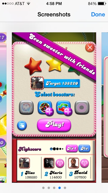
Because captions aren’t allowed, Candy Crush Saga adds text to the screenshots. 

8. False claims and inaccurate information. Avoid stuffing in false keywords for SEO. Describing your game as “combat” when it’s “target practice” may be disappointing to those who download it. Resist using over the top superlatives like “the best”, “award winning” unless you can back it up. Most people have become desensitized to these types of advertising claims.
9. Unsuitable vocabulary. Avoid a writing style suited for a trade magazine or tech journal. Here is not the place for industry terminology, abbreviations and acronyms. And there’s no need for complex, pretentious vocabulary. The goal is to communicate with your audience. Connect with them.
10. Not written for the device and store. There’s very limited space before “…more” in the App Store. Craft your first sentence so that it all fits, before getting cutoff. But leave readers wanting more. Study how the same copy will layout differently on an iPhone, iPad, various Android devices, Google Play and Amazon stores.
Blood, sweat and tears went into creating your game. Don’t take merchandising lightly. Making a great game today is only half the battle. From this list, focus on the points returning the biggest bang for the buck. A few carefully chosen words can make all the difference in the world.
If you have more reasons why App Store game descriptions suck, please share them here.
If you enjoyed this article, please consider sharing it!


This problem extends to other apps as well…If the game or app developer can’t follow your tips Jerry, a good public relations or marketing pro is only a phone call away.
Thanks for your comments Stephanie! In this case I specifically wanted to address game developers. Candy Crush Saga/King is one of the two top publishers in mobile gaming today. Being one of the best casual games ever, with a ginormous viral component can overcome many things.
Most games struggle to get users and must fire on all cylinders to reach their potential. I hope my post encourages developers to realize the importance of their messaging and not underestimate the value of good marketing.
A great read.. Thanks from a developer point of view , these points really matter